Mastering the Art of Data Visualization in R
Game, Frontend Dev and a masochist when it comes to programming languages. But why I torture myself??
Welcome to the enchanting world of data visualization, where data wizards like you can work their "wiz-data" magic and transform numbers into captivating graphics. In R, the spellbinding statistical programming language, you have all the tools at your disposal to create mesmerizing data visualizations. But first, let's equip you with the ultimate data visualization wand by installing the ggplot2 package. Then we'll wave our data wands and embark on a journey to make some chart-topping plots!
Step 1: Install ggplot2
To get started, you need to install and load the ggplot2 package. This package will empower you with the tools to create stunning data visualizations in R. Run the following code in your R console to install and load ggplot2:
# Install and load the ggplot2 package
install.packages("ggplot2")
library(ggplot2)
Step 2: Install plot3D
In addition to ggplot2, you'll also need the plot3D package to create 3D plots. To install the plot3D package, use the following code:
# Install and load the plot3D package
install.packages("plot3D")
library(plot3D)
With both ggplot2 and plot3D at your disposal, you're now ready to dive into the enchanting world of data visualization and explore the magic of 3D plots.
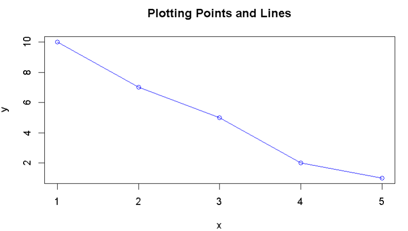
Plotting Points and Lines with plot()
The plot() function is like the trusty wand of a data wizard, helping you "point" out the crucial data and "draw lines" of insight. With a little "abracadata," you can work your visual magic and reveal hidden patterns that were previously concealed by the data's mystical veil.
# Cast a spell with the plot() function
x <- c(1, 2, 3, 4, 5)
y <- c(10, 7, 5, 2, 1)
plot(x, y, type = "o", col = "blue", main = "Plotting Points and Lines")
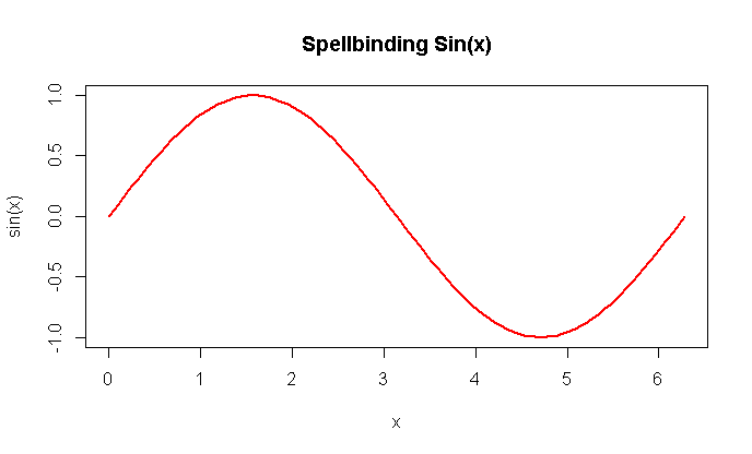
Plotting a Mathematical Function
Now, let's dive into the world of mathematical functions and see how to "spell-bind" those equations into captivating visuals. It's like turning math into art, a "sine-ister" plot twist only a data wizard could master!
# Conjure a sine function
curve(sin(x), from = 0, to = 2 * pi, col = "red", lwd = 2, main = "Spellbinding Sin(x)")
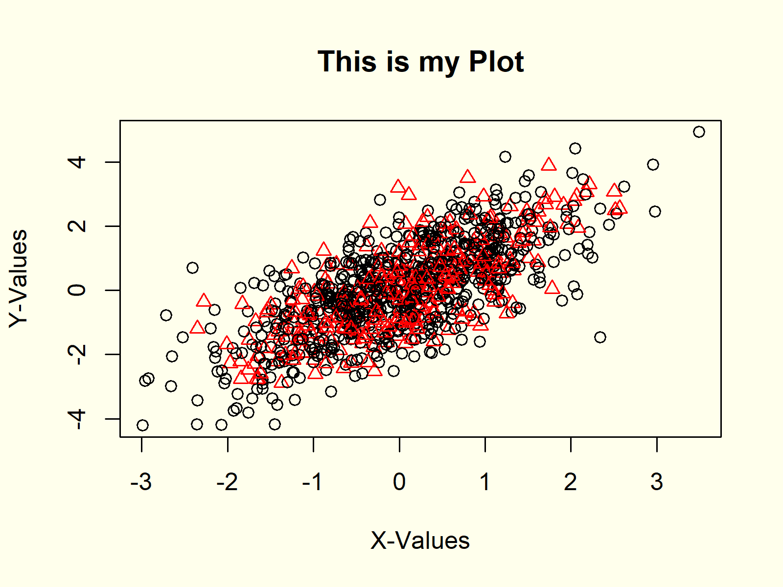
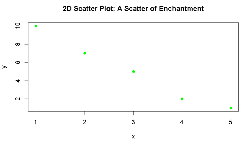
2D Scatter Plots
Scatter plots allow you to "scatter" your data points like magic dust in a fairytale. You can "conjure up" valuable insights and watch your ideas "blossom" into something enchanting. It's all about the "point" of view, after all!
# Scatter your data like magic
x <- c(1, 2, 3, 4, 5)
y <- c(10, 7, 5, 2, 1)
plot(x, y, pch = 19, col = "green", main = "2D Scatter Plot: A Scatter of Enchantment")
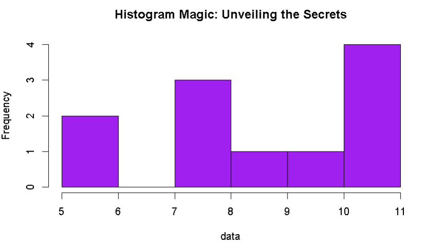
Histograms
Histograms are like the "spell books" of data visualization, helping you "conjure" the distribution of your data with precision. It's like practicing the ancient art of "histo-mancy" to reveal the secrets hidden in your data.
# Master the magic of histograms
data <- c(5, 5, 8, 8, 8, 9, 10, 11, 11, 11, 11)
hist(data, breaks = 5, col = "purple", main = "Histogram Magic: Unveiling the Secrets")
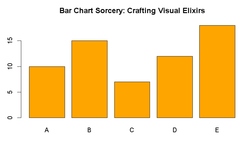
Bar Charts
Bar charts are the "wand-wielders" of data visualization, casting a spell that turns data into an artful potion. They're like the "bartenders" of the data wizardry world, serving up insights in colorful goblets, garnished with information!
# Brew some data magic with bar charts
categories <- c("A", "B", "C", "D", "E")
values <- c(10, 15, 7, 12, 18)
barplot(values, names.arg = categories, col = "orange", main = "Bar Chart Sorcery: Crafting Visual Elixirs")
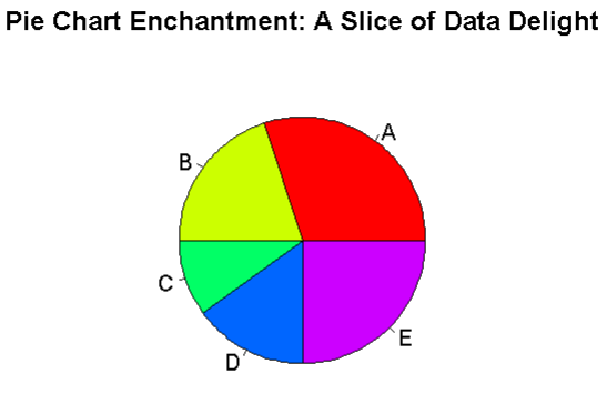
Pie Charts
Pie charts are as delightful as a "magic pie" on a Sunday afternoon. They're like the enchanted desserts of data visualization, slicing up the data into bite-sized pieces. Just make sure not to let the magic "disappear" from the chart!
# Slice into the magic of pie charts
slices <- c(30, 20, 10, 15, 25)
labels <- c("A", "B", "C", "D", "E")
pie(slices, labels = labels, col = rainbow(length(slices)), main = "Pie Chart Enchantment: A Slice of Data Delight")
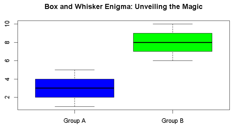
Box and Whisker Plots
Box and whisker plots help you unravel the story behind your data's "box office" performance. It's like a "whisker-ious" journey into the unknown, where only a data wizard can decode the magical messages hidden within.
# Decode the magic of box and whisker plots
data <- list(a = c(1, 2, 3, 4, 5), b = c(6, 7, 8, 9, 10))
boxplot(data, col = c("blue", "green"), names = c("Group A", "Group B"), main = "Box and Whisker Enigma: Unveiling the Magic")
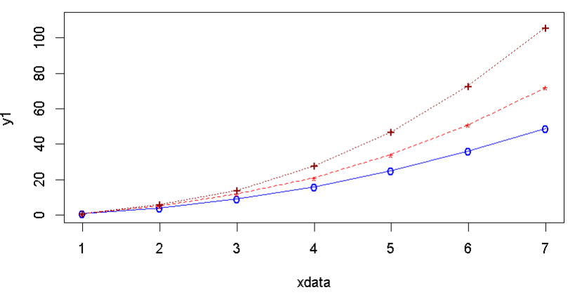
Multiple Curves on the Same Plot
Overlaying multiple curves on the same plot is like a "wand-off" between mathematical functions, a duel where the "curve-magicians" compete for the spotlight in your magical visualization!
# Duel of the curve-magicians
# Define 3 data sets
xdata <- c(1,2,3,4,5,6,7)
y1 <- c(1,4,9,16,25,36,49)
y2 <- c(1, 5, 12, 21, 34, 51, 72)
y3 <- c(1, 6, 14, 28, 47, 73, 106)

# Plot the first curve by calling plot() function
# First curve is plotted
plot(xdata, y1, type="o", col="blue", pch="o", lty=1, ylim=c(0,110))

# Add second curve to the same plot by calling points() and lines()
# Use symbol '*' for points.
points(xdata, y2, col="red", pch="*")
lines(xdata, y2, col="red", lty=2)

# Add Third curve to the same plot by calling points() and lines()
# Use symbol '+' for points.
points(xdata, y3, col="dark red", pch="+")
lines(xdata, y3, col="dark red", lty=3)
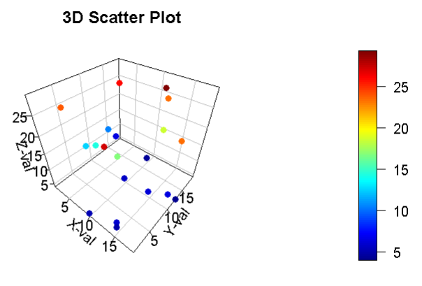
3D Scatter Plots with plot3D
Elevate your data wizardry with 3D scatter plots using the scatter3D() function from the plot3D library. This function allows you to create captivating 3D scatter plots in R, adding an extra dimension to your data visualization. Here's an example:
# Create a 3D scatter plot with plot3D
library(plot3D)
npoints <- 20

# Generate sequences for X, Y values
x <- runif(npoints, 1, 20)
y <- runif(npoints, 1, 20)

# Generate random numbers for Z values
z <- 30 * runif(npoints)

# Create a 3D scatter plot
scatter3D(x, y, z, box = TRUE, pch = 16, bty = "b2", axes = TRUE, label = TRUE, nticks = 5, ticktype = "detailed", theta = 40, phi = 40, xlab = "X-val", ylab = "Y-val", zlab = "Z-val", main = "3D Scatter Plot")
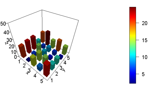
3D Histograms with plot3D
Unleash the magic of 3D histograms using the hist3D() function from the plot3D library. This function allows you to visualize the distribution of three-dimensional data. It's like sculpting your data into a 3D masterpiece! Here's an example:
# Create a 3D histogram with plot3D
library(plot3D)
x <- c(1, 2, 3, 4, 5)
y <- c(1, 2, 3, 4, 5)
zval <- c(20.8, 22.3, 22.7, 11.1, 20.1, 2.2, 6.7, 14.1, 6.6, 24.7, 15.7, 15.1, 9.9, 9.3, 14.7, 8.0, 14.3, 5.1, 6.5, 19.7, 21.9, 11.2, 11.6, 3.9, 14.8)

# Convert Z values into a matrix
z <- matrix(zval, nrow = 5, ncol = 5, byrow = TRUE)

# Create a 3D histogram
hist3D(x, y, z, zlim = c(0, 50), theta = 40, phi = 40, axes = TRUE, label = TRUE, nticks = 5, ticktype = "detailed", space = 0.5, lighting = TRUE, light = "diffuse", shade = 0.5)
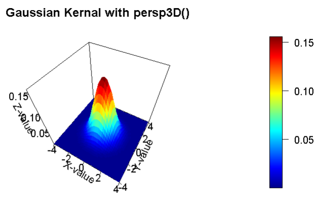
3D Surface Plots with plot3D
Take your data visualization to new heights with 3D surface plots using the persp3D() function from the plot3D library. This function allows you to represent functions of two variables in three dimensions. Here's an example:
# Create a 3D surface plot with plot3D
library(plot3D)
x <- seq(-4, 4, by = 0.2)
y <- seq(-4, 4, by = 0.2)
z <- matrix(NA, nrow = length(x), ncol = length(y))
sigma <- 1.0
mux <- 0.0
muy <- 0.0
A <- 1.0

for (i in 1:length(x)) {
  for (j in 1:length(y)) {
    z[i, j] <- A * (1 / (2 * pi * sigma^2)) * exp(-((x[i] - mux)^2 + (y[j] - muy)^2) / (2 * sigma^2))
  }
}

# Create a 3D surface plot
persp3D(x, y, z, theta = 30, phi = 50, axes = TRUE, scale = 2, box = TRUE, nticks = 5, ticktype = "detailed", xlab = "X-value", ylab = "Y-value", zlab = "Z-value", main = "Gaussian Kernal with persp3D()")
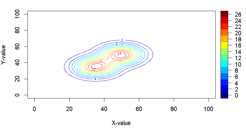
Contour Plots with plot3D
Contour plots are like treasure maps for data wizards. They help you visualize the variations in a two-dimensional surface, making it easier to identify patterns and hidden gems in your data. Use the contour2D() function from the plot3D library to create contour plots. Here's an example:
# Create a contour plot with plot3D
library(plot3D)

## Gaussian across X  and Y
##  2D Gaussian Kernal
x = seq(0,100,0.2)
y = seq(0,100,0.2)

## We generate 2 Gaussian kernals and add them to create a double eyed structure.
z = matrix(data=NA, nrow=length(x), ncol=length(x))
z1 = matrix(data=NA, nrow=length(x), ncol=length(x))
z2 = matrix(data=NA, nrow=length(x), ncol=length(x))

sigma = 8.0
sigma1 = 8
sigma2 = 8
mux = 50.0
muy = 50.0
mux1 = 35.0
muy1 = 35.0
A = 10000.0
A1 = 1.0

for(i in 1:length(x))
{
  for(j in 1:length(y))
  {
    z1[i,j] =  A * (1/(2*pi*sigma1*sigma2)) * exp( -((x[i]-mux1)^2 + (y[j]-muy1)^2)/(2*sigma1*sigma2) )

    z2[i,j] =  A * (1/(2*pi*sigma^2)) * exp( -((x[i]-mux)^2 + (y[j]-muy)^2)/(2*sigma^2) )

    z[i,j] = z1[i,j] + z2[i,j]
  }
}
## plot contour using contour2D() function of plot3D libraty
contour2D(z,x,y, xlab="X-value", ylab="Y-value")
With the power of ggplot2 and its extensions, you're well on your way to becoming a true data wizard. Whether you're crafting 3D scatter plots, sculpting 3D histograms, reaching new heights with 3D surface plots, or deciphering the secrets in contour plots, your data wizardry knows no bounds.
With R and the mighty ggplot2, you can add a dash of "wiz-data" magic to your data visualization. "Wave" your data wand, "conjure up" insights, and don't forget to slice a piece of the data "pie" while "enchanting" your distributions. Stay tuned for more "plot-teresting" data wizardry in our mystical journey through the realm of data visualization!